Creating Story Bar Widget
How to create a Stories bar Widget?
A Stories, in a nutshell, is a full-screen visuals that blend video, images, CTAs and interactive stickers.
Use can use this widget to create a Instagram-like tap-through story groups for different proposes: showcase promos, shoppable content, tutorials, feature adoption, etc.
Create a Story bar Widget
For creating a Story bar widget, click on + Create widget in the top left corner and chose the Story bar option. The next steps will be giving a unique name to help you identify it later and hit Create Widget button.

Edit Story bar Widget Design
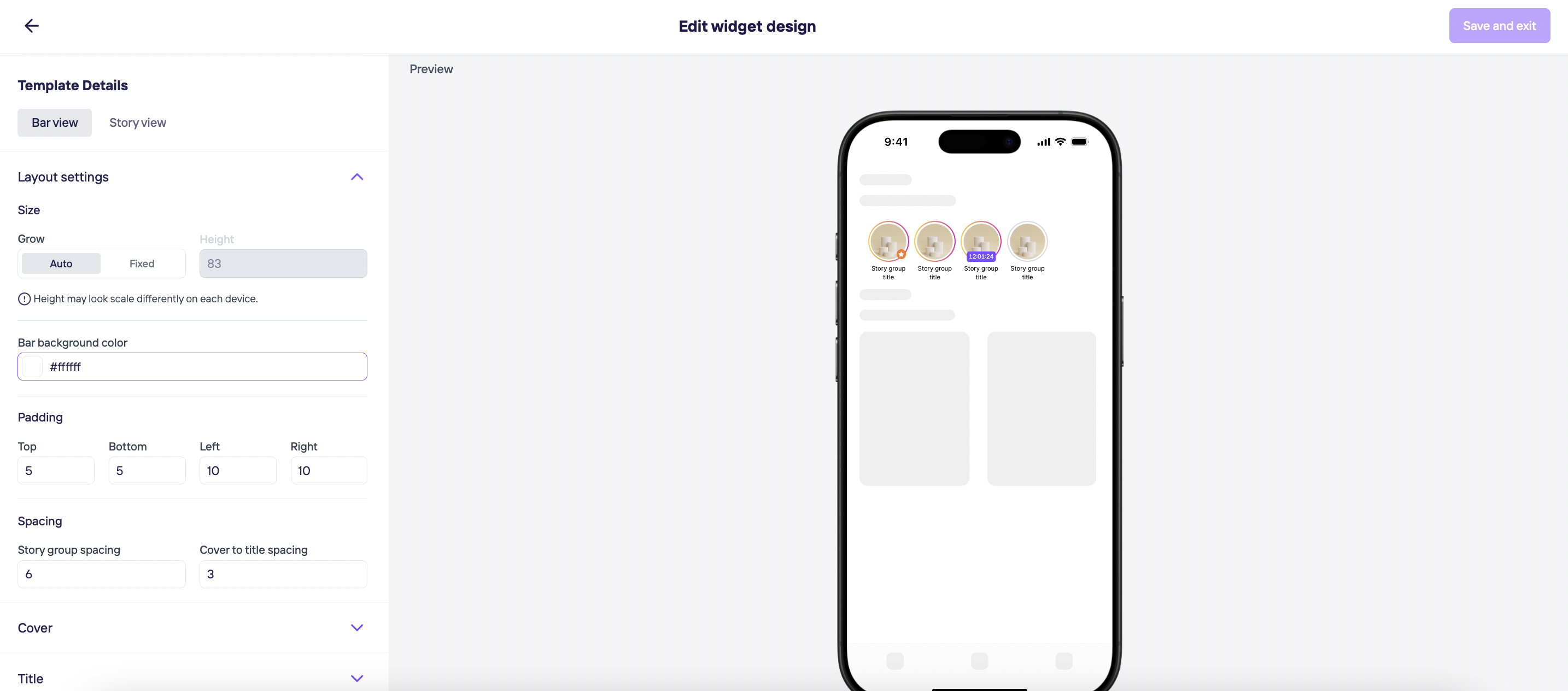
After creating your Story bar widget, you can click the 3 dots button to edit their Current theme, Layout and Settings. Or delete this widget in case you need to do it.

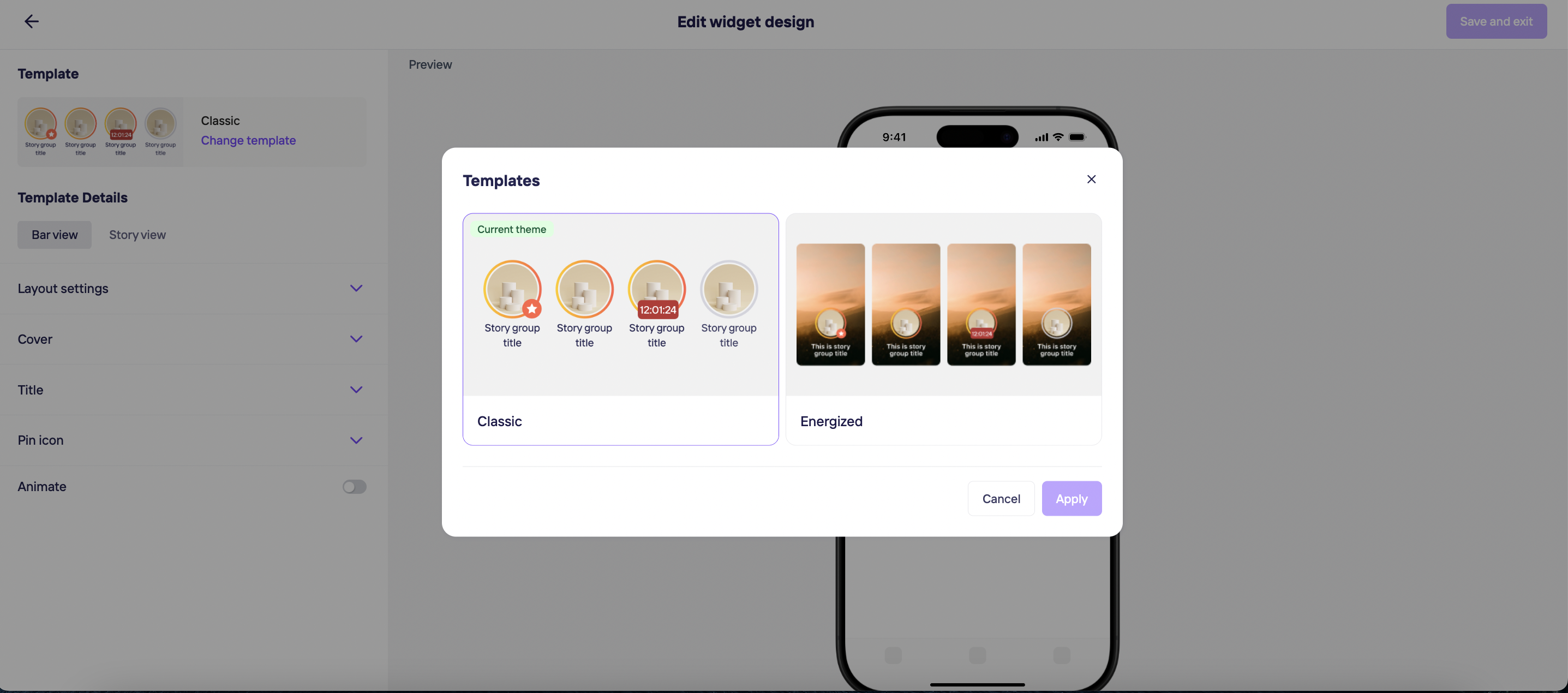
By clicking on Edit design, you decide on your template details:
- There are 2 default Widget styles which are Classic and Energized. Pick a style and let's get into the customization!
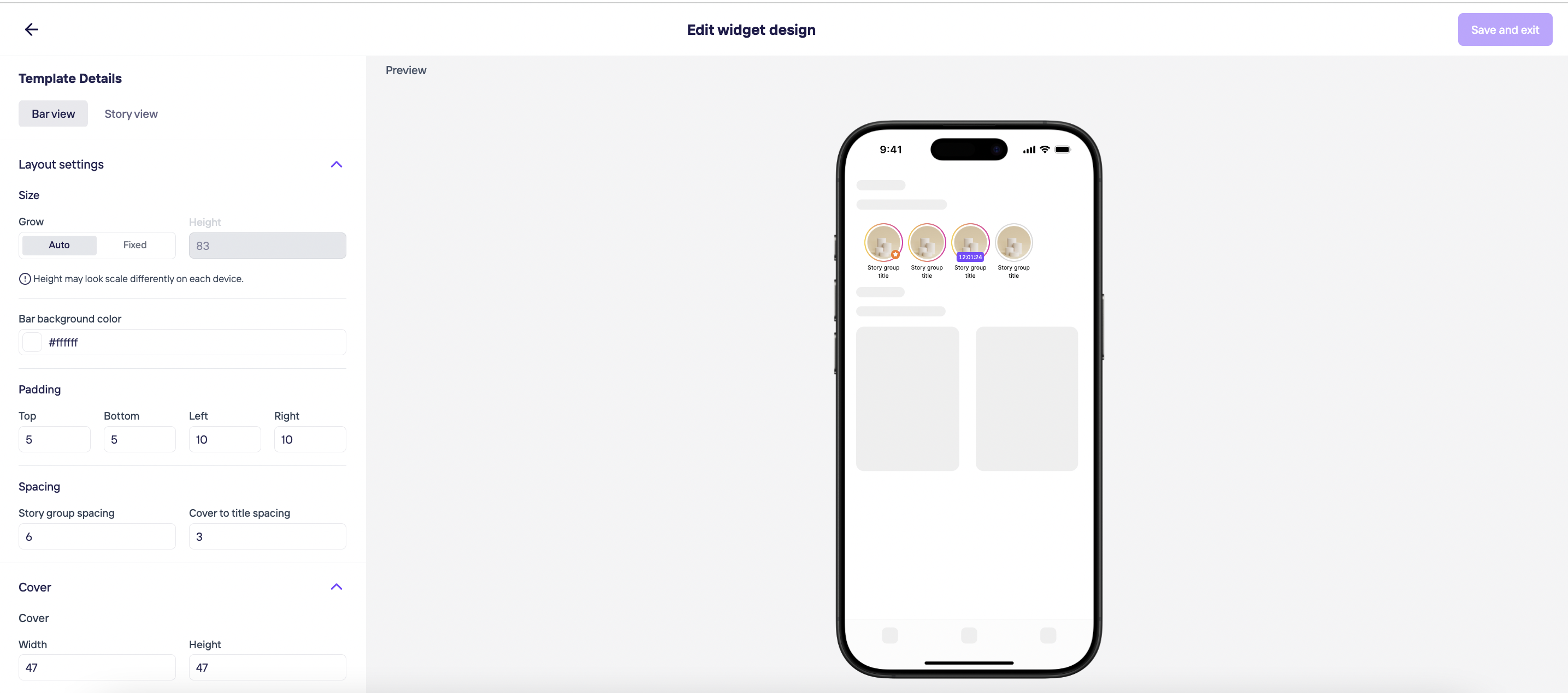
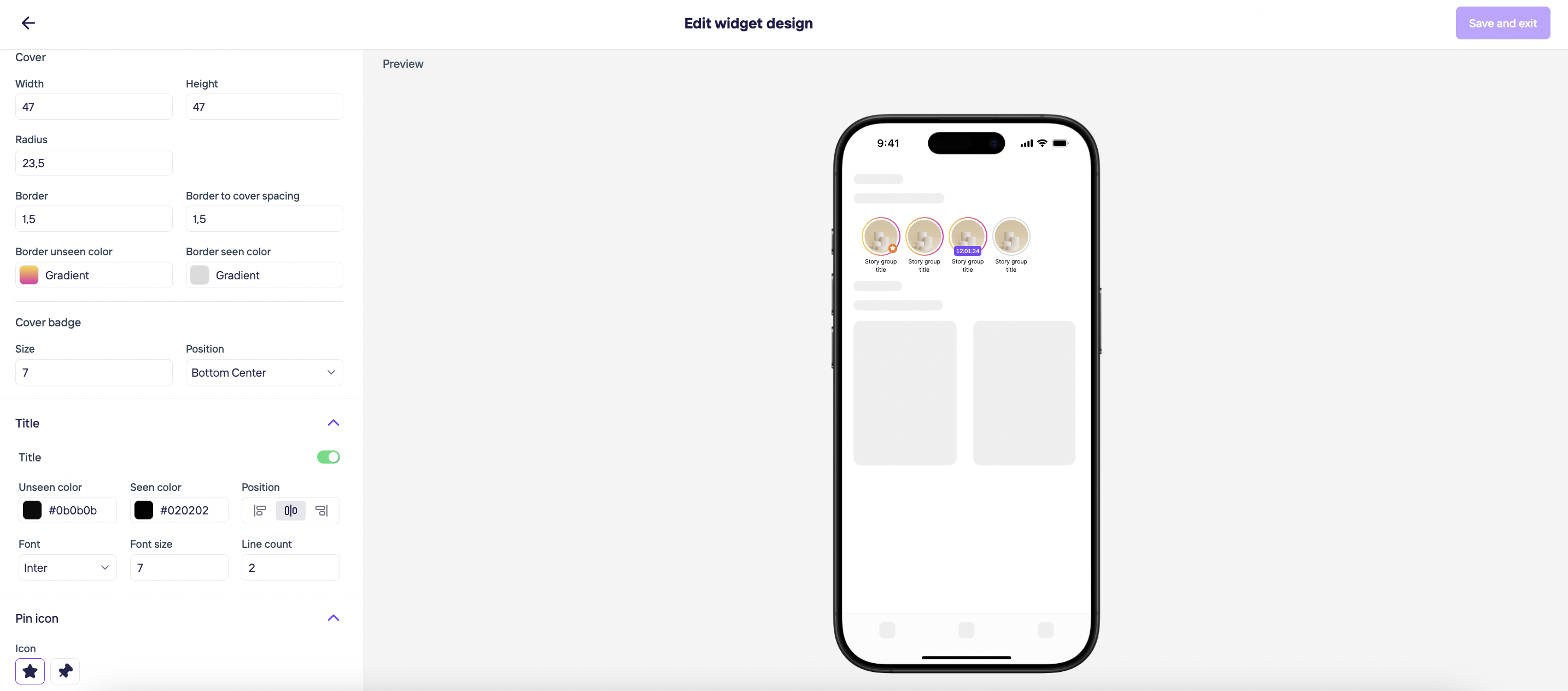
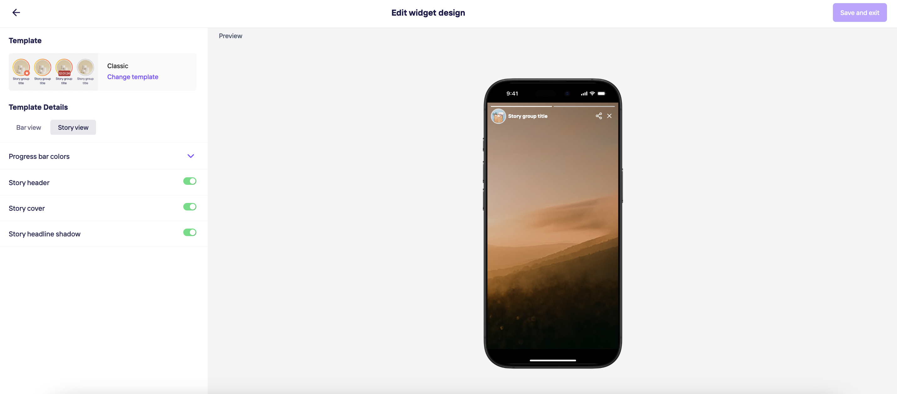
- After deciding on the style, you can customize bar view (paddings, spacing, radius, colors, text font & size & color, pin icon & cover badge positions, and enable/disable animations) and story view (progress bar colors, story header, story cover, story headline shadow). Every change you make will be reflected in the preview.
Warning to Developer
Height input is the height of the section that is given to the Storyly View within the application.
- Auto Height: When set to Auto, the Storyly View will automatically adjust its height dynamically. This ensures that any design changes requiring a height adjustment are handled by the Storyly SDK without manual intervention on the integration.
- Manual Height: If you prefer a fixed height for the Storyly View section in your app, disable Auto and enter the desired height manually.
Auto Height is the recommended option since it provides the flexiblity to change the design on the go.
Warning to Developer
The Storyly SDK automatically resizes inner elements based on the chosen Widget Style, ensuring all components maintain their aspect ratio. It guarantees that no elements will be cut off or overlap within the Storyly View.
If Energized is selected, since the first unseen Story of the Group is shown in the background, there is an extra set of adjustments for the Thumbnail and you will be able to change the position of the Cover & title in respect to Thumbnail.
Tip
Animations are only applied when the story cover is a perfect circle. To achieve this, the cover’s width and height must be equal, and the radius should be half of the width/height.
Once all is done, you're ready to Save and exit the design.
Tip
Please allow up to 5 minutes for any design changes to be reflected in the live environment.
Warning
If any UI customizations were made during Storyly SDK integration, they will override the design assigned to the Widget.
The hierarchy is as follows:
Widget design created on the Dashboard > Customizations done on the app > Default layout of the SDK
All done! 🎉 You can see the design applied to the Widget under Apps & Websites.
If you'd like to revert to the Default design you've defined while integrating the SDK, you can just click on the Reset widget design under the three-dots menu.
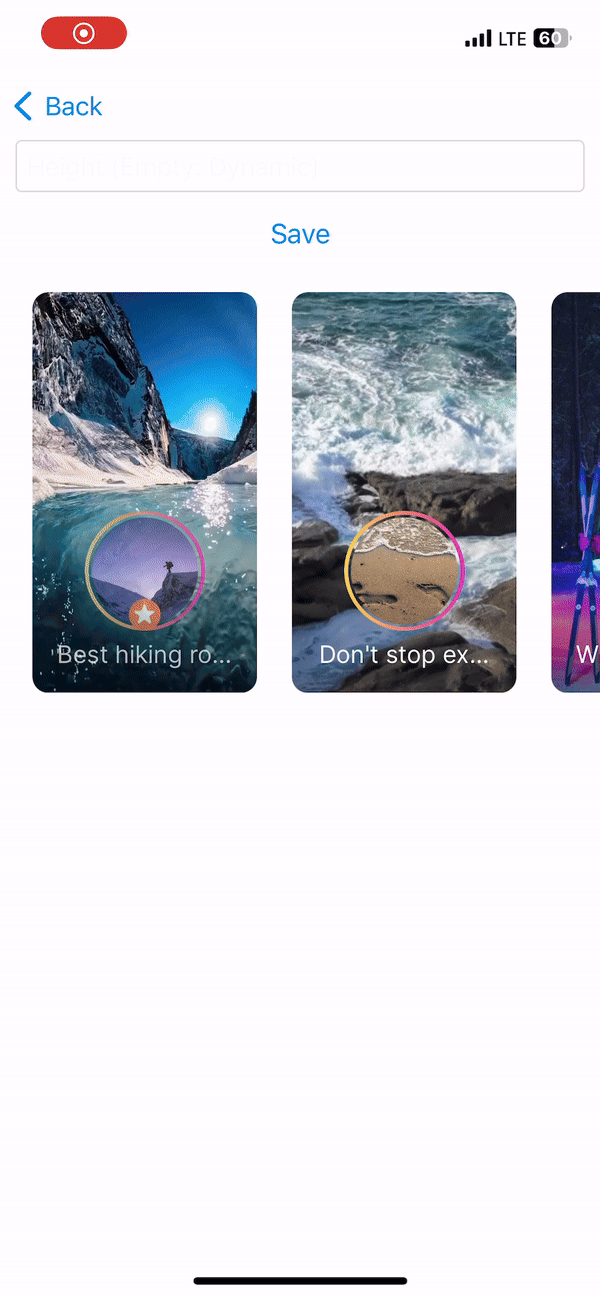
Energized Style
If the Energized style is applied, the experience on the app can be seen below.
- The cover of the 1st visible Story Group on the screen disappears
- The first unseen Story in the Story Group starts playing
- If the Story is a video, it's previewed for 7 seconds.
- If the Story is an image, slight zoom-in & zoom-out animation is applied for 7 seconds.
- After 7 seconds, the preview moves on with the 2nd visible Story Group on the screen.
- If there are 3 Story Groups visible on the screen, after completing the preview of each, the cycle starts from the 1st Story Group and repeats.
- If the end user scrolls the Story Bar, the same logic applies starting from the 1st visible Story Group on the screen.
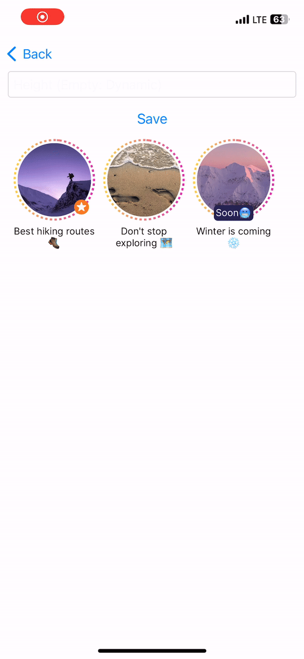
Classic Style
If the Classic style is applied, the experience on the app can be seen below.
Updated 7 months ago