Set Up Storyly Bar
This guide shows you how to customize the Storyly experience of your users.
Story Bar Customizations
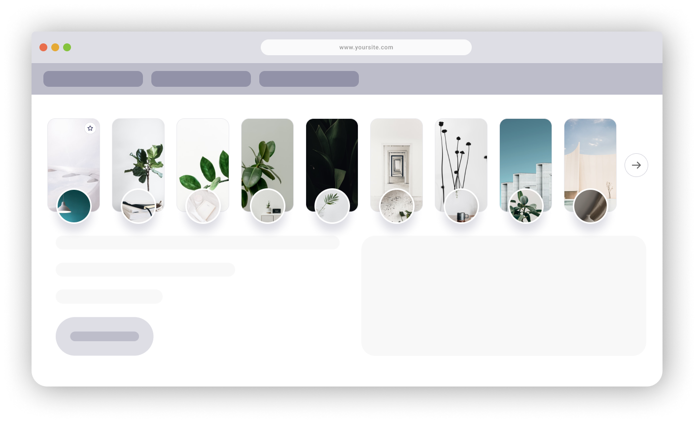
Storyly Bar Scroll Indicator
This styling adds the scroll indicator to your Storyly Bar.
In order to set this attribute, use the following method:
storylyWeb.init({
  ...
  props: {
    scrollIndicator: Boolean, // e.g. true/false
    scrollIndicatorOptions: {
      indicatorWidth: Number, // e.g. 32
      indicatorHeight: Number, // e.g. 32
      indicatorBorderWidth: Number, // e.g. 1
      indicatorBorderRadius: Number, // e.g. 16
      indicatorBorderColor: "HEX/RGBA", // e.g. #D8D8D8
      indicatorBoxBackgroundColor: "HEX/RGBA", // e.g. #FFFFFF
      indicatorDefaultIconsColor: "HEX/RGBA", // e.g. #000000
      indicatorBoxShadow: 'CSS',
      customLeftIndicator: URL,
      customRightIndicator: URL,
      leftIndicatorMargin: Number, // e.g. 8
      rightIndicatorMargin: Number, // e.g. 8
    }
  }
});
Warning
The
customLeftIndicatorandcustomRightIndicatorURL extensions must be either .jpeg or .png.
Storyly Layout Direction
This attribute changes the layout direction of the Storyly Bar and Story-watching experience. Storyly Bar can either be LTR (Left to right) or RTL (Right to left).
storylyWeb.init({
  direction: 'rtl' | 'ltr',
});
Story Group Customizations
Storyly Bar Layout (Grid / Orientation)
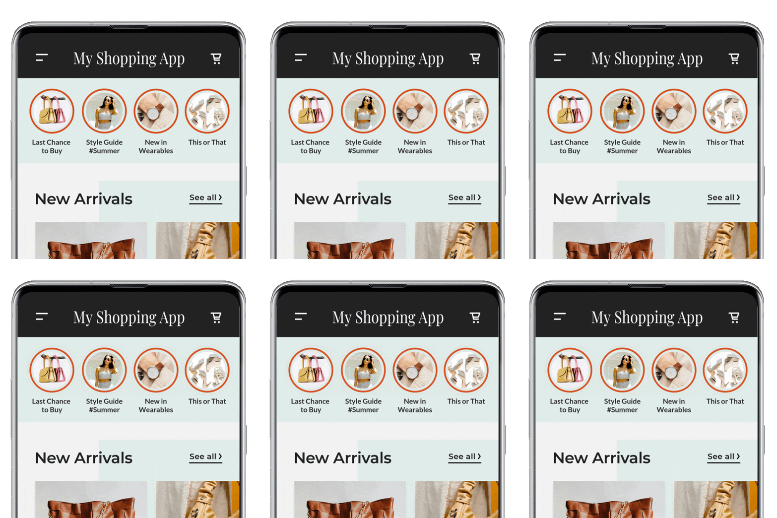
This attribute customizes the layout of the Storyly Bar. You can switch between horizontal/vertical orientation and configure a grid-like appearance by controlling how story groups are sectioned and spaced.
Use barStyling inside props during initialization:
storylyWeb.init({
  barStyling: {
    orientation: 'horizontal' | 'vertical',
    section: Number,
    horizontalPaddingBetweenItems: Number,
    verticalPaddingBetweenItems: Number,
  },
});
Story Group Text Not Seen Color
This attribute changes the text color of the story group.
In order to set this attribute, use the following method:
storylyWeb.init({
  ...
  props: {
    storyGroupTextColor: "HEX/RGBA"
  }
});
Story Group Text Seen Color
This styling changes the text color of the story group that are seen by the user. The default seen story group text color is #333.
In order to set this styling, use the following method:
storylyWeb.init({
  ...
  props: {
    storyGroupTextSeenColor: "HEX/RGBA"
  }
});
Story Group Text Visibility
This styling changes the visibility of story group text.
In order to set this attribute, use the following method:
storylyWeb.init({
  ...
  props: {
    storyGroupTextVisibility: true/false
  }
});
Story Group Text Font
This styling changes the font of story group text.
In order to set this attribute, use the following method:
storylyWeb.init({
  ...
  props: {
    storyGroupTextFont: "FONT"
  }
});
Story Group Text Size
This styling changes the size of the story group text. The default story group text size is 12.
In order to set this styling, use the following method:
storylyWeb.init({
  ...
  props: {
    storyGroupTextSize: "PIXEL" // e.g. 4
  }
});
Story Group Text Weight
This styling changes the weight of the story group text. The default story group text weight is normal.
In order to set this styling, use the following method:
storylyWeb.init({
  ...
  props: {
    storyGroupTextWeight: 'CSS' // e.g. normal
  }
});
Story Group Text Line Height
This styling changes the height of the story group text lines. The default story group text line height is 1.
In order to set this styling, use the following method:
storylyWeb.init({
  ...
  props: {
    storyGroupTextLineHeight: '1'
  }
});
Story Group Text Margin Top
This styling changes the distance between the story group text and story group icon. The default distance in between is 6.
In order to set this styling, use the following method:
storylyWeb.init({
  ...
  props: {
    storyGroupTextMarginTop: "PIXEL"
  }
});
Story Group Pin Icon Image
This attribute changes the image of the story group pin icon.
In order the set this attribute, use the following method:
storylyWeb.init({
  ...
  props: {
    storyGroupPinIcon: 'URL'
  }
});
Story Group Pin Icon Background Color
This styling changes the background color of story group pin icon.
In order the set this styling, use the following method:
storylyWeb.init({
  ...
  props: {
    storyGroupPinBackgroundColor: "HEX/RGBA" // e.g. #FFCB00
  }
});
Story Group Pin Icon Border Color
This styling changes the border color of story group pin icon.
In order the set this styling, use the following method:
storylyWeb.init({
  ...
  props: {
    storyGroupPinBorderColor: "HEX/RGBA" // e.g. #FFCB00
  }
});
Story Group Icon Border Seen State Color
This attribute changes the border color of the story group icons that are seen by the user. The border consists of color gradients.
Warning
At least 2 colors must be defined in order to use this attribute. If a single color is requested, a same color code can be used twice.
In order to set this attribute, use the following method:
storylyWeb.init({
  ...
  props: {
    storyGroupIconBorderColorSeen: ["HEX/RGBA", "HEX/RGBA"]
  }
});
Story Group Icon Border Not Seen State Color
This attribute changes the border color of the story group icons that are unseen by the user. The border consists of color gradients.
Warning
At least 2 colors must be defined in order to use this attribute. If a single color is requested, a same color code can be used twice.
In order to set this attribute, use the following method:
storylyWeb.init({
  ...
  props: {
    storyGroupIconBorderColorNotSeen: ["HEX/RGBA", "HEX/RGBA"]
  }
});
Story Group Icon and Border Gap Thickness
This styling changes the gap thickness between the story group icon and seen/unseen border. The default gap in between is 2.
In order to set this styling, use the following method:
storylyWeb.init({
  ...
  props: {
    storyBorderGapSize: "PIXEL"
  }
});
Story Group Icon and Border Gap Color
This styling changes the gap color between the story group icon and seen/unseen border. The default color of the gap is #fff.
In order to set this styling, use the following method:
storylyWeb.init({
  ...
  props: {
    storyBorderGapColor: "HEX/RGBA"
  }
});
Story Group Size
This attribute changes the size of the story group. The default story group size is 50x50.
In order to set this attribute, use the following method:
storylyWeb.init({
  ...
  props: {
    storyGroupSize: "PIXELxPIXEL" // e.g. 50x50
  }
});
Story Group Border Size
This attribute changes the border size of the story group. The default story group border size is 4.
In order to set this attribute, use the following method:
storylyWeb.init({
  ...
  props: {
    storyGroupBorderSize: "PIXEL" // e.g. 4
  }
});
Story Group Icon Styling
This styling changes the shape of the story group icons, their corners, and the distance between each other. Users can create square, rectangular shape, circle, and oval-shaped icons using these attributes.
In order to set this attribute, use the following method:
storylyWeb.init({
  ...
  props: {
    storyGroupBorderRadius: "PIXEL" // e.g. 10
  }
});
Story Group List Styling
This styling changes the distance between the story groups.
In order to set this attribute, use the following method:
storylyWeb.init({
  ...
  props: {
    storyGroupMarginHorizontal: "PIXEL" // e.g. 10
  }
});
Story Group List Alignment
This styling changes the alignment of the story groups.
In order to set this attribute, use the following method:
storylyWeb.init({
  ...
  props: {
    storyGroupAlign: "left/center/right"
  }
});
Story Group Animation
This attribute adds an animation to the story group cover.
storylyWeb.init({
  ...
  props: {
    storyGroupAnimation: {
      type: String,
      mode: Boolean,
    }
});
Warning
typeis the type of the animation, and currently there is only 1 type, which ispulse.- Story Group animation applies to Unseen Story Groups only.
- Story Group animation is not available for Custom Story Group Styling.

Warning
- The default
modeisfalse. When it'sfalse, animations will be applied to all Story Groups. (see above)- If the
modeis set astrue, animations will be applied to 1st Story Group only. (see below)

Story Customizations
Story Interactive Text Font
This styling changes the typeface of all text view's font in interactive components.
In order to set this attribute, use the following method:
storylyWeb.init({
  ...
  props: {
    storyTextFont: "FONT"
  }
});
Custom Story Group Styling
This guide shows you how to customize the story group view's style. Storyly provides three different pre-defined story group styles; Small, Large and Custom. However, if you want to use a different style other than these pre-defined ones or if pre-defined ones do not satisfy your expectations then you should follow this section.
Warning
If you are using pre-defined sizes and want to apply only some customizations, follow UI Customizations section.
Customizable Classes
The following classes are fully customizable.
Tip
Please note that the following classes are optional.
storyly__story-preview
storyly__story-group-cover
storyly__story-group-pin
storyly__story-group-title
storyly__story-group-seen
storyly__story-preview-video-wrapper
Storyly Web SDK allows you to create custom Story Groups in the initialization process. Please use the following definition to use your HTML to set custom Story Groups.
storylyWeb.init({
  ...
  customStoryGroupHTML: "HTML"
});
Tip
If you use
storyly__story-previewclass, Storyly will use the image screenshot of the first unseen Story. If the Story content is a video, Storyly will use the thumbnail of the video.
Custom Story Group Structure

You can use the following template to create custom Story Groups. custom-story-group-container and custom-story-group class names are defined by us for example purposes only.
You may simply add the classes which we have described above in the following HTML template.
Warning
The following HTML must be defined between
divtags.
Warning
You must use
imgtag forstoryly__story-group-coverclass.
Warning
The following
HTMLmust beString.
<div class="custom-story-group-container">
        <div class="custom-story-group">
            <div class="storyly__story-preview" fallbackURL="https://g2.img-dpreview.com/C7E98764B33A491FB5130BBDBB17E78C.jpg"></div>
              <img class="storyly__story-group-cover" />
              <span class="storyly__story-group-pin">
                <svg width="24" height="24" viewBox="0 0 24 24" fill="none" xmlns="http://www.w3.org/2000/svg">
                  <rect x="0.25" y="0.25" width="23.5" height="23.5" rx="11.75" fill="white" stroke="#D3D3DC" stroke-width="0.5">
                  <rect width="12" height="12" transform="translate(6 6)" fill="white"/>
                  <path fill-rule="evenodd" clip-rule="evenodd" d="M12 7L13.545 10.13L17 10.635L14.5 13.07L15.09 16.51L12 14.885L8.91 16.51L9.5 13.07L7 10.635L10.455 10.13L12 7V7Z" stroke="#242450" stroke-linecap="round" stroke-linejoin="round"/>
                </svg>
              </span>
              <div class="storyly_story-group-badge"><span class="storyly_story-group-badge-text"></span></div>
        </div>
    </div>
Warning
If
storyly__story-group-previewclass cannot fetch the data, thefallbackURLwill be used as preview image.
Tip
If you use the
storyly__story-preview-video-wrapperclass, Storyly will use the video of the first unseen Story which includes a video.You can use
<div class="storyly__story-preview-video-wrapper"></div>tag inside of<div class="custom-story-group">tag.Moreover, you can use the CSS that is shared below, you can add it to our CSS example or you can customize it.
.custom-story-group .storyly__story-preview,
.custom-story-group .storyly__story-preview-video-wrapper {
  position: absolute;
  left: 0;
  right: 0;
  top: 0;
  bottom: 0;
  background-size: cover;
  background-position: center;
  background-repeat: no-repeat;
  border-radius: 16px;
  overflow: hidden;
}
Class Examples
The following classes are for example purposes only. You may customize your own CSS by using the following classes.
    .custom-story-group-container {
      cursor: pointer;
      height: 230px;
      width: 107px;
      margin-right: 24px;
    }
    .custom-story-group-container .custom-story-group {
      position: relative;
      cursor: pointer;
      height: 190px;
      width: 107px;
      border-radius: 16px;
      border: 1px solid rgba(0, 0, 0, 0.2);
    }
    .custom-story-group .storyly__story-preview {
      position: absolute;
      left: 0;
      right: 0;
      top: 0;
      bottom: 0;
      background-size: cover;
      background-position: center;
      background-repeat: no-repeat;
      border-radius: 16px;
    }
    .custom-story-group .storyly__story-group-cover {
      height: 72px;
      width: 72px;
      border-radius: 50%;
      position: absolute;
      bottom: -36px;
      left: 18px;
      border: 3px solid #ffffff;
      box-sizing: border-box;
      filter: drop-shadow(0px 16px 20px rgba(36, 36, 80, 0.16));
      background: var(
          --border-unseen-color,
          linear-gradient(to right, rgba(122, 75, 255, 1), rgba(0, 224, 228, 1))
        )
        border-box;
    }
    .custom-story-group .storyly__story-group-pin {
      z-index: 1;
      position: absolute;
      right: 8px;
      top: 8px;
    }
.custom-story-group .storyly_story-group-badge {
      left: 53px;
      position: absolute;
      bottom: -36px;
      z-index: 2;
      display: flex;
      justify-content: center;
      align-items: center;
    }
    .custom-story-group .storyly_story-group-badge .storyly_story-group-badge-text {
      font-family: Storyly-Inter, sans-serif;
      white-space: nowrap;
      overflow: hidden !important;
      text-overflow: ellipsis;
      border-radius: 4px;
      padding: 4px;
      font-weight: 500;
      font-size: 12px;
      line-height: 1;
      background-color: var(--badge-background-color);
      color: var(--badge-text-color);
    }
.custom-story-group .storyly__focal-point-wrapper {
        height: 72px !important;
        width: 72px !important;
        border-radius: 50% !important;
        bottom: -36px !important;
        left: 18px !important;
        border: 3px solid #ffffff !important;
        filter: drop-shadow(0px 16px 20px rgba(36, 36, 80, 0.16));
        background: var(
            --border-unseen-color,
            linear-gradient(to right, rgba(122, 75, 255, 1), rgba(0, 224, 228, 1))
          )
          border-box;
      }
SetProperties Method
This section shows you how to change Properties after initializing Storyly Web SDK.
Before you begin
You need to have the working Storyly integration as described in Initial Web SDK Setup.
In order to change the Properties, use the following method;
storylyWeb.setProperties({
  storyGroupAlign: "left",
  storyGroupSize: "90x90",
});
Remove Method
This section shows you how to remove all Storyly assets.
Before you begin
You need to have the working Storyly integration as described in Initial Web SDK Setup.
In order to remove all Storyly assets, use the following method;
storylyWeb.remove();
Updated 12 days ago
