UI Customizations with Widget Gallery
This guide shows you how to customize the Storyly experience with Widget Gallery.
Storyly Bar Sizing Migration Guide
Storyly provides two ways to define the Storyly Bar (StorylyView) size in an app:
Static Sizing – Developer explicitly sets height
Dynamic Sizing – SDK automatically adjusts size
Warning
- With Storyly SDK 3.1+ (previously SDK 2.19), the migration introduces Instance Style-based sizing, giving more flexibility and preventing UI breakage across different devices.
- If an app has a custom SDK implementation that affects layout, SDK Customization will override Instance Style.
- Handling the SDK customizations will ensure backward compatibility while allowing controlled customization.
Storyly Bar Static Sizing
When the height and width parameters are manually set up with static sizing
Keynotes
- The SDK resizes inner elements (such as icons) based on a fixed ratio defined in the Storyly Dashboard’s Instance Style settings.
- Guarantees no clipping or overlapping by keeping elements within bounds.
- The developer must ensure the given size fits the layout across different screen sizes.
Warnings
- You control the size, but be cautious about responsiveness on different screen sizes.
To ensure StorylyView adapts correctly, the SDK follows a specific formula. The aim is to make height fitting, according to the preview height. Here the preview height is divided by static view height and the ratio is used to calculate other parameters.
Formula
StorylyView Height Value = Preview Height Value / Static Height View Value
- Preview Height: The height of the StorylyView in the design preview.
- Static View Height: The height value that is provided by the application.
Example Cases
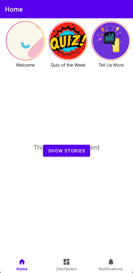
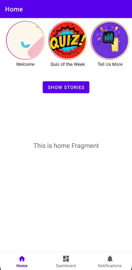
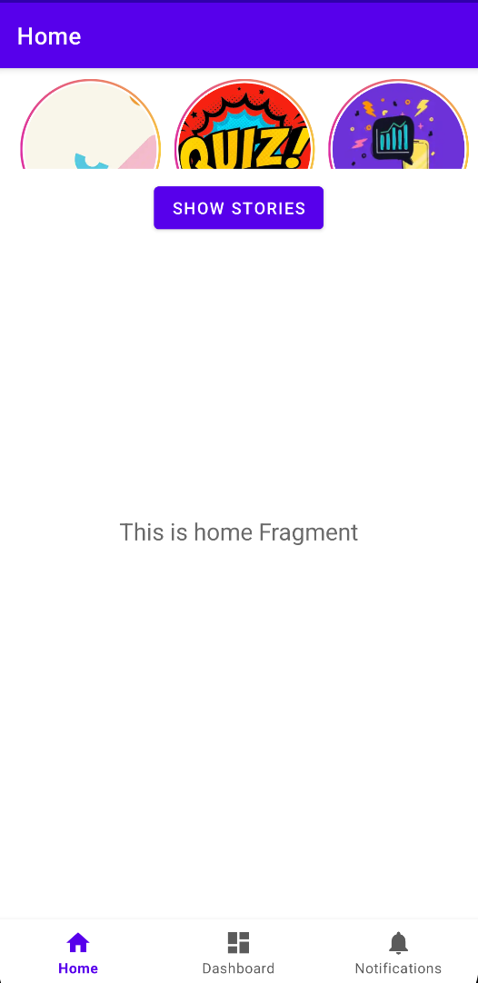
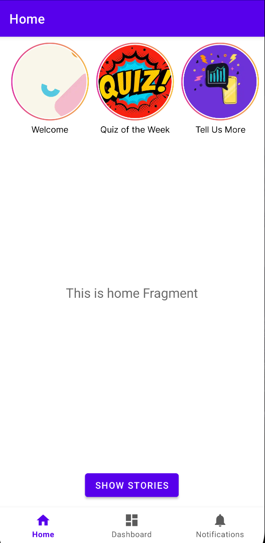
Let's keep the height value on application side as 200dp and change the Preview Height value and walk through the observations. The plan of the UI is to see 3 stories on the widget in app.
- Preview Height -> 200, Ratio -> 1.0, StorylyView will use the whole space that is assigned in the application (200dp)
- Preview Height -> 100, Ratio -> 0.5, StorylyView will scale down to 50% which is 100dp
- Preview Height -> 50, Ratio -> 0.25, StorylyView will scale down to 25% which is 50dp
- Preview Height -> 350, Ratio -> 1.75, StorylyView will scale up to 175% which is 350dp (the maximum value)
Warnings
- The snapshots belong to the same emulator with different values, if the device screen size changes the UI will be adjusted according to the same ratios but will look different.
Storyly Bar Dynamic Sizing
With Dynamic Sizing, the developer does not define a fixed width and height. Instead, the SDK calculates the StorylyView size dynamically using Device screen width and height
Keynotes
- The SDK automatically adjusts to match the design specified in the Storyly Dashboard.
- Works across multiple devices for a responsive and consistent experience.
Warnings
- Dynamic Sizing ensures flexibility, but developers must adapt their layout to accommodate SDK adjustments.
StorylyView height is calculated dynamically based on device screen size, here the ratio of Preview Height to the Preview device height is equal to the ratio of StorylyView height to Device height in each device.
Formula
StorylyView Height Value / Device Height Value = Preview Height Value / Device Height Value
- Preview height: The height of the StorylyView in the design preview.
- Preview device height: The height of the preview device screen.
- Device height: The height of the actual device screen.
- StorylyView Height: The height of the actual Storyly view based on device.
onSizeChanged event
This event is triggered to notify about StorylyView size changed for updating parent view size
Warnings
- Only when using Widget Gallery from Storyly Dashboard.
Updated 11 months ago