

Accessibility Guide
How Storyly Placement widgets work with screen readers, and how to make your content accessible.
We aim to make Storyly content accessible to everyone, so people with disabilities can get the most out of it. Storyly Placement widgets work with the device's built-in screen reader: TalkBack on Android and VoiceOver on iOS. No accessibility API call is needed; the SDK handles it for you.
How it works
Once the end user turns on the screen reader on their device, Storyly Placement becomes accessible:
- No autoplay. Stories and banner slides move on only when the user acts.
- Single tap moves focus to an element and reads it. Double tap performs its action.
- Previous / Next buttons appear on screen, so content can be navigated without swipe gestures.
- Built-in labels such as "Close Story" or "Slide 1 of 4" are read in the user's language. See Supported languages.
The content your team creates is read as written: titles, button texts, alt text and video transcripts all come from the Storyly Dashboard.
Accessibility features by widget
| Widget | Android & iOS | Web |
|---|---|---|
| Story Bar | Supported | Supported |
| Banner | Supported (SDK 1.18.0+) | Not yet supported |
| Video Feed | Supported | Partially supported (accessibility mode, keyboard navigation) |
| Swipe Card, Canvas | Not yet supported | Not yet supported |
Story Bar
Story groups
- Story group order, for example "Story position 1 of 5"
- Story group title
- Story group status: seen / unseen, and pinned
Stories
- Story position, for example "Story 2 of 4"
- Alt text or video transcript of the story (see Describing your content)
- Labeled Close and Share buttons, and share sheet options
- CTAs read with their titles (for example Swipe Up, Buy Now)
- Previous / Next Story buttons for navigation
- Play, Pause and Replay buttons in the story header (SDK 1.1.0+)
Interactive components
| Read by the screen reader | Not read by the screen reader |
|---|---|
| Text, Button, Swipe Up, Image Button, Poll, Quiz, Image Quiz (alt text per option), Product Card, Product Catalog | Video, Rating, Emoji, Countdown, Comment, Promo Code, Product Tag, Image components other than the story background |
Banner (SDK 1.18.0+)
- Each slide is one element. Its text is read, then its position: "Big Autumn Sale, Up to 50% off, Slide 1 of 4".
- Image and video slides read the alt text set in the Dashboard.
- A slide with a link is read as a button. A button without text is read as "Open link".
- Reading order: Play / Pause → Previous → Next → slide.
- Previous / Next are disabled on the first and last slide. On iOS, a three-finger swipe also changes slides.
- In right-to-left layouts, the arrows switch direction.
Play / Pause button. Turn it on in Widget Builder → Banner → Design → Navigation → Play/Pause button and set its icon and background colors for light and dark mode. It lets users stop auto-advancing slides, which supports WCAG 2.2.2 (Pause, Stop, Hide) on Android and iOS.
Remember!
The Play / Pause button is off by default. It has a 44 × 44 touch area and appears when slides auto-advance or the banner contains video.
Describing your content: Alt Text and Video Transcript
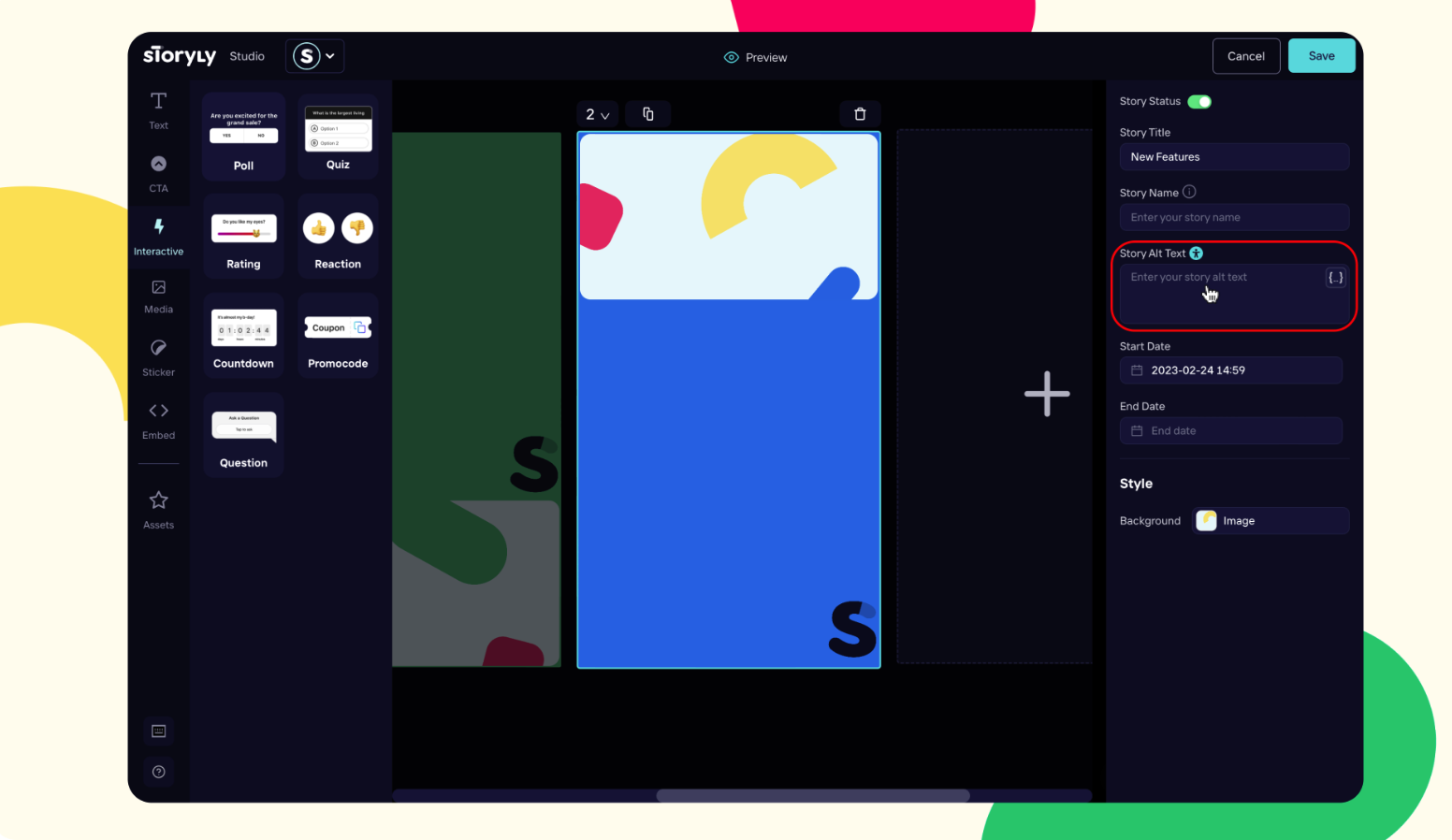
The screen reader can only read what you describe. In Storyly Studio, the field you use depends on the story's background:
| Story background | Field to fill in | What the screen reader reads |
|---|---|---|
| Static (image) | Alt Text | The image description |
| Video | Video Transcript | The transcript of the video |
How to add it: open the story group in Storyly Studio, click the story name, fill in the Alt Text or Video Transcript field, and save. For banners, add alt text to each image or video slide in the Dashboard.
Tip
Components that the screen reader does not read (such as Countdown, Promo Code or Rating) can still be made accessible. Include the information they carry, for example the promo code or the end date, in the story's Alt Text or Video Transcript.
Only the story's background image uses the story alt text. Other Image components placed on the story are not read, so describe them in the alt text as well when they carry information.
Supported languages
Built-in labels are read in this order of priority:
- The
localeset inSTRPlacementConfig - The device language
- English, when neither is supported
| Language | Android & iOS | Web |
|---|---|---|
| English (default), German, Hebrew, Portuguese, Spanish, Turkish | ✅ | ✅ |
| Polish | ✅ (SDK 1.12.0+) | — |
For right-to-left languages, set setLayoutDirection(STRLayoutDirection.RTL) in STRPlacementConfig. Your Dashboard content is read as written; use Localization in the Dashboard to serve it in several languages.
Adding your own language
To add a language or change a built-in label, add Storyly's string keys to your app's localization files: values-<code>/strings.xml on Android, <code>.lproj/Localizable.strings on iOS. Your values override the SDK's. Use %1$d / %1$s on Android and %d / %@ on iOS.
| Key | English value |
|---|---|
st_desc_story_next / st_desc_story_previous | Next Story / Previous Story |
st_desc_story_share / st_desc_story_close | Share Story / Close Story |
st_desc_video_play / st_desc_video_pause / st_desc_video_replay | Play / Pause / Replay |
st_desc_story_group_pinned | Story position %d of %d, %@, pinned, %@ |
st_desc_story_group_unpinned | Story position %d of %d, %@, %@ |
st_desc_seen / st_desc_unseen | seen / unseen |
st_desc_story_index | Story %d of %d |
st_desc_title_text | Title %@, %@ |
st_desc_swipeup / st_desc_imagecta | Swipe Up / Image Button |
st_desc_poll_with_title / st_desc_poll_without_title | Poll sticker, %@ / Poll sticker |
st_desc_poll_after_selection | %@, was selected by %d%% of users |
st_desc_quiz_with_title / st_desc_quiz_without_title | Quiz sticker, %@ / Quiz sticker |
st_desc_quiz_after_poll | %@, %@, was selected by %d%% of users |
st_desc_quiz_after_sngl_true / st_desc_quiz_after_sngl_false | %@, %@ is the correct answer / %@, %@ is the wrong answer |
st_desc_option_a … st_desc_option_d | Option A … Option D |
st_share_sheet_title_text / st_share_sheet_copy_text / st_share_sheet_copied_text | Share Story / Copy Link / Copied |
st_share_sheet_link_via / st_share_sheet_screenshot_via | Share via… / Share image via… |
Banner keys (SDK 1.18.0+)
| Key | English value |
|---|---|
st_banner_desc_default | Banner |
st_banner_desc_slide_position | Slide %1$d of %2$d |
st_banner_desc_open_link | Open link |
st_banner_desc_next_slide / st_banner_desc_previous_slide | Next slide / Previous slide |
st_banner_desc_play / st_banner_desc_pause | Play / Pause |
Web Placement
On the web, the story presenter works with browser screen readers and the keyboard. Its labels are available in English, German, Hebrew, Portuguese, Spanish and Turkish.
| Key | Action |
|---|---|
| → / ← | Next / Previous story |
| Space | Play / Pause |
| Esc | Close story |
| S | Share story |
Users can switch accessibility mode on from the presenter, and its state is announced. Mute, Pause and transcript controls are labeled, and links that open in a new tab are announced. Video Feed supports accessibility mode and keyboard navigation.
Known limitations
- Web Banner: no screen reader support or Play / Pause button yet; the Dashboard setting is ignored, so auto-advancing web banners cannot be paused.
- Swipe Card and Canvas: no dedicated screen reader support yet.
- Text size: the system font size (Dynamic Type on iOS, font scale on Android) is not applied to widget text.
- Video audio can play over the screen reader's speech.
- Product bottom sheets: some labels are incomplete.
Remember!
Accessibility features are available in Storyly Placement SDK for Android, iOS, React Native and Flutter. Use SDK 1.18.0 or later to get Banner accessibility.
Updated 2 days ago