

Banner Design Guide
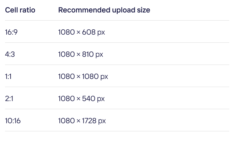
Recommended size
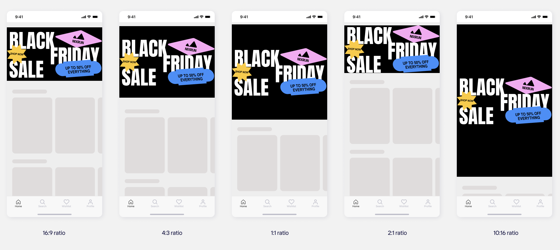
Banner appears as a full-width strip on the page. Choose a slide ratio and upload your media at the matching size.
Safe Zone
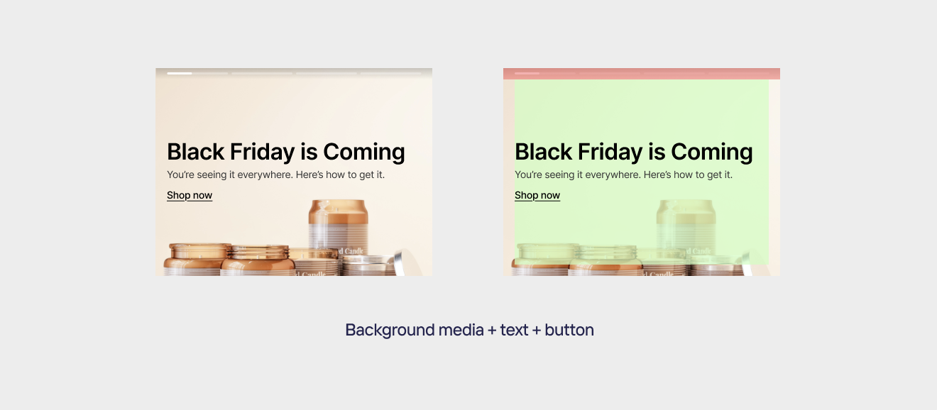
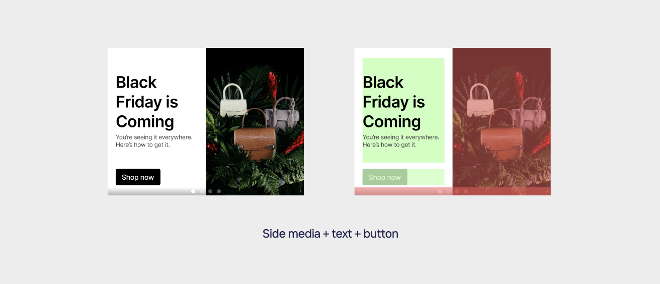
If you add a heading, description, or button, where they appear depends on your media layout. Plan your design so they stay clear and readable.
- Background media: your text and button appear over the image. Keep the area behind them simple and make sure there's enough contrast so the text stays readable.
- Side media: your text and button sit in a separate panel next to the image, so the image itself stays clear. Just make sure your text has enough contrast with the panel background.
- You can place the heading, description, and button in different positions, so plan your layout with that in mind.
- If you prefer full control, leave these off and design your own text and buttons directly into the image.
Slideshow vs Carousel
Banner has two layouts. Both use the same slide ratio and upload size — the difference is how slides are shown.
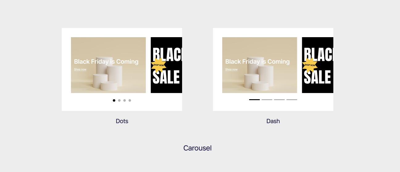
- Slideshow: one full-width slide at a time. Each slide uses the entire banner width, so your media has the most room.
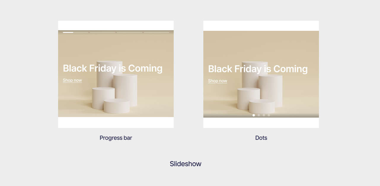
- Carousel: multiple slides side by side, swipeable. Slides appear narrower, so keep key content and text large enough to stay readable at a smaller size
Customizing the interface
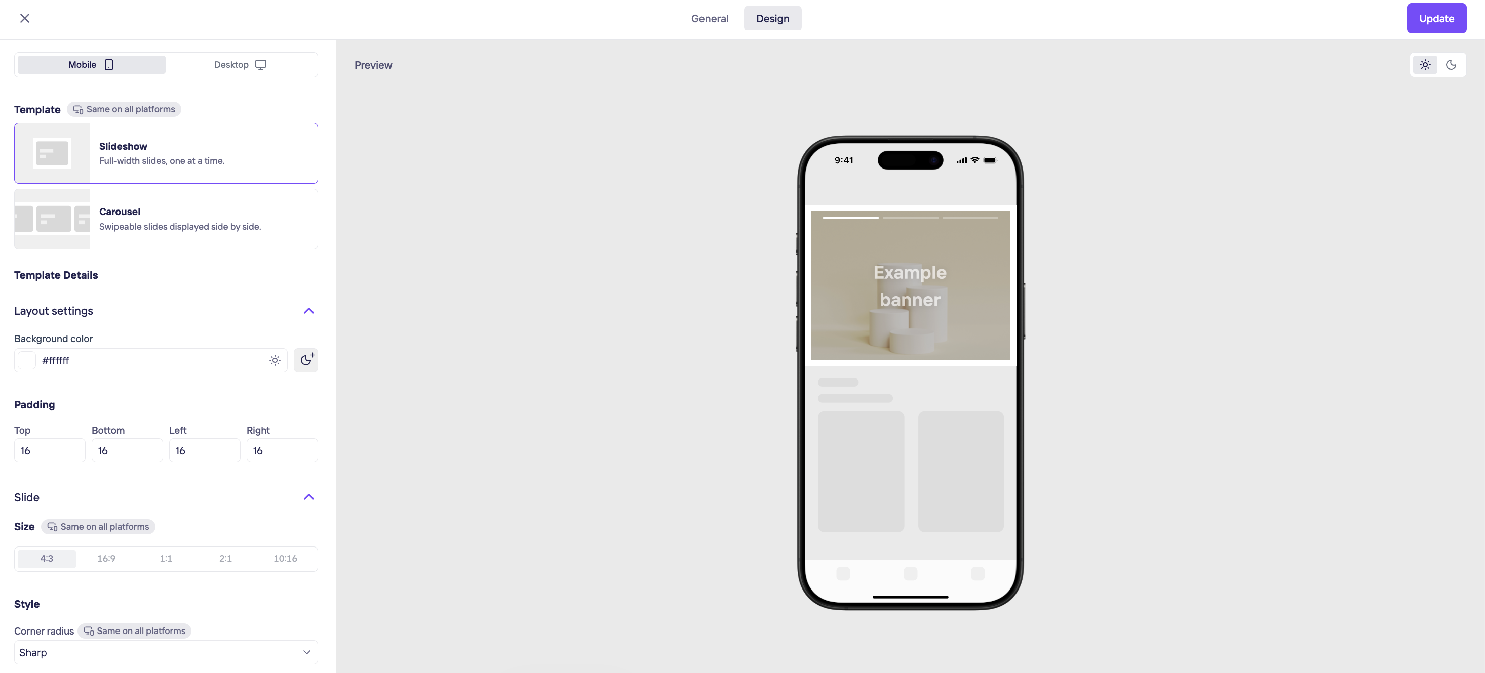
You can customize the following in the dashboard, under the Banner widget's Design tab.
- Template (Layout): Choose between Slideshow, where one full-width slide shows at a time, and Carousel, where multiple slides appear side by side and can be swiped.
- Slide size (Ratio): Choose the slide's aspect ratio: 4:3, 16:9, 1:1, 2:1, or 10:16. This is the same ratio covered in Recommended size.
- Background color (Style): Separate values can be set for light and dark themes.
- Corner radius is defined as a percentage of the slide's shorter edge, so it scales proportionally with the slide size rather than using a fixed pixel value.
Sharp — 0%
Soft — 15%
Rounded — 30%
Playful — 50% - Border: None by default. When enabled, you can add a border around the slide and set its color.
- Padding: Top, Bottom, Left, and Right padding for the widget's outer spacing.
- Navigation:Show a progress bar, dots, or none to indicate slide position, and set its color.
- Autoplay: Turn automatic sliding on or off, and set how many seconds each slide stays on screen.
- Title (optional — can be turned off): Heading and description can each be turned on or off. Font, size, weight, color, and alignment. You can also set the text position — where the heading and description appear on the banner.
- Button (optional — can be turned off): Choose No button, Text button, or Fill button. Set the button text, action URL, fill color, and corner radius.
Updated about 23 hours ago
Did this page help you?