

Initial Setup
This guide covers the core concepts, architectural benefits, and a step-by-step implementation to help you integrate Storyly Placement into your Web application.
What is Placement
Storyly Placement is a powerful, server-driven framework designed to dynamically render various widget experiences—such as Story Bars, Banners, and Swipe Cards—within a single host view. By decoupling the UI configuration from your app's codebase, Placement enables you to switch between different widget types in real-time without requiring a new app release.
Widgets
A Widget is a modular, visual content block like a Story, Banner, Swipe Card, Vertical Feed, or Canvas. Widgets are goal-oriented, fully customizable, and can be placed and updated through the dashboard
Flows
A flow is a pre-configured flow of one or more widgets designed to serve a specific business goal such as product discovery, conversion, retention, or loyalty. Each flow comes with built-in content logic and optional AI features to personalize the experience per user. Once set up, Storyly automatically manages what to show, when to show it, and to whom—maximizing impact without additional manual effort.
Placement Architecture
Server Driven SurfacePlacement is a server-driven surface that can render different Storyly experiences (e.g., Story Bar, Banner) in a single host view, based on configuration and rules fetched at runtime.
Single Integration PointIt centralizes data loading, rendering, analytics, and commerce hooks via a single provider and a single view, enabling sophisticated, dynamic experiences without hardcoding which widget to show.
Core Building Blocks
These core building blocks are mandatory to integrate and start enabling features with Storyly Flows
Placement Blocks
Placement Data ProviderIt fetches and manages the content/config for a placement and exposes listener callbacks.
Placement ConfigIt controls test mode, user/targeting context, and layout direction.
Placement ViewIt hosts the actual widget determined at runtime (e.g., Story Bar, Banner), exposes UI and analytics callbacks, and adapts its size to the selected widget.
Setup SDK
Import Module
Before you use Storyly Placement on Web, you must first import the Storyly Placement Web module.
This module registers the <storyly-placement> Web Component, which acts as a server-driven rendering surface.
<script
  src="https://web-story.storyly.io/releases/1.*/storyly-placement.js"
  type="module"
></script>
Info
The latest version of Storyly Placement SDK is available after 1.0.0 You can follow the latest version updates from here.
Before you begin
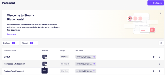
Please login to Storyly dashboard and get your placement token. You can get it from Storyly Dashboard ->
Initialize Components
This section explains how to set up and connect the core Placement components: data provider, placement view, and listener callbacks.
Placement Element
You need to add the <storyly-placement> element to your page.
This element acts as the host surface that dynamically renders different widget types (Story Bar, Banner, etc.) based on server-side configuration.
<div id="storylyPlacementContainer">
  <storyly-placement id="storylyPlacement"></storyly-placement>
</div>
Info
The parent container controls the layout and size of the Placement.
Placement will render into the available space provided by this container.
Placement Configuration
You must configure Placement by passing your Placement token during initialization. This tokens determines which placement is rendered, which widget type is active and which content and rules are applied.
<script>
  (async () => {
    await customElements.whenDefined("storyly-placement");

    const storylyPlacement = document.getElementById("storylyPlacement");
    const storylyPlacementContainer = document.getElementById(
      "storylyPlacementContainer"
    );

    const config = {
      token: "<your_placement_token>",
    };

    storylyPlacement.init(config);
  })();
</script>
Setup Layout Direction
This section explains how to control the layout direction of the widget rendered inside a Storyly Placement, allowing it to match your website’s user interface direction.
You need to set direction in the Placement configuration object to configure whether the widget should render in left-to-right (LTR) or right-to-left (RTL) mode.
const config = {
  token: "<your_placement_token_here>",
  direction: "rtl", // or "ltr" (default) };

storylyPlacement.init(config);
Setup Widget Theme
This section explains how to control the color theme of the widget rendered inside a Storyly Placement, so it blends in with your site's light or dark appearance.
You set the widget color theme by passing the theme field in the config object during initialization.
const config = {
  token: "<your_placement_token>",
  theme: "dark", // or "light" (default)
};

storylyPlacement.init(config);
theme accepts one of two string values:
| Value | Appearance | When to use |
|---|---|---|
"light" | Light theme (default) | Hosts with a light background, or site in light mode. |
"dark" | Dark theme | Hosts with a dark background, or site in dark mode. |
Warning
Make sure Dark Mode is enabled in the Widget Design page of the Storyly Dashboard.
Placement Lifecycle Events
Storyly Placement provides lifecycle events that allow your application to react to widget state changes, layout requirements, and user interactions.
To observe these events, you must register event listeners on the <storyly-placement> element.
const config = {
  token: "<your_placement_token>",
};
Info
widgetReadyThis event is triggered when the active widget is ready to render.
It indicates that the widget configuration has been fetched and layout sizing can be applied.
actionClickedThis event is triggered when the user interacts with the widget’s action area (e.g., swipe-up or action button).
Placement Size Handling
This section explains how to resize the Placement container when the widget becomes ready.
The widgetReady event notifies your application when the widget is ready to render.
You should apply width and height to the Placement container at this point to ensure correct rendering.
storylyPlacement.on("widgetReady", (data) => {
  storylyPlacementContainer.style.width = "100%";
  storylyPlacementContainer.style.height = "500px";
  console.log("onWidgetReady", data);
});
Warning
You must test with different widget types from the Dashboard’s Placement page to verify that dynamic sizing behaves as expected.
This should be used as a validation step during integration.
Placement Action Handling
This section shows how to handle Swipe Up and Action Button clicks from users. Redirection and action handling must be implemented by the application itself.
To do this, listen to the actionClicked event and handle the provided data accordingly.
 storylyPlacement.on("actionClicked", (event) => {
      const { url, payload } = event;
      console.log("onActionClicked:", url, payload);
    });
Warning
Please confirm that the actionClicked event is triggered for all interactive content.
Validate navigation behavior and check logs during testing.
Best Practices
You must honor widgetReady before applying layout sizing
You must handle actionClicked for all user-driven navigation
Do not hardcode widget type or behavior on the client side
Setup on Marketing Tools
This section shows how to add Storyly to your marketing tool and show your content in it.
Google Tag Manager
You can import and init Storyly by copying below lines to Google Tag Manager, please remember to replace your_placement_token with your own.
<script>
  (function (targetClass) {
    var storylyScript = document.createElement("script");
    storylyScript.setAttribute("type", "module");
    storylyScript.setAttribute(
      "src",
      "https://web-placement.storyly.io/releases/1.*/storyly-placement.js",
    );
    document.body.appendChild(storylyScript);

    var storylyPlacementContainer = document.createElement("div");
    storylyPlacementContainer.classList.add("storyly-placement-container");
    var storylyTag = document.createElement("storyly-placement");
    storylyTag.id = "storyly-placement";
    storylyPlacementContainer.appendChild(storylyTag);
    var heading = document.querySelector("." + targetClass);

    if (heading) {
      heading.parentElement.insertBefore(
        storylyPlacementContainer,
        heading.previousSibling,
      );
    }

    storylyScript.onload = function () {
      customElements.whenDefined("storyly-placement").then(function () {
        storylyTag.on("widgetReady", function (data) {
          storylyPlacementContainer.style.width = "100%";
          storylyPlacementContainer.style.height = "500px";
        });

        storylyTag.on("actionClicked", function (data) {
          console.log("Action tıklandı:", data);
        });

        storylyTag.init({
          token: "<your_placement_token>",
        });
      });
    };
  })("CLASS_NAME");
</script>
Warning
Storyly will be positioned before the section named
CLASS_NAME. Please do not forget to put correct class name into this field.
A Complete Example
<script>
  (async () => {
    await customElements.whenDefined("storyly-placement");

    const storylyPlacement = document.getElementById("storylyPlacement");
    const storylyPlacementContainer = document.getElementById(
      "storylyPlacementContainer"
    );

    const config = {
      token: "<your_placement_token>",
    };

    storylyPlacement.on("widgetReady", (data) => {
      storylyPlacementContainer.style.width = "100%";
      storylyPlacementContainer.style.height = "500px";
      console.log("onWidgetReady", data);
    });

    storylyPlacement.on("actionClicked", (event) => {
      const { url, payload } = event;
      console.log("onActionClicked:", url, payload);
    });

    storylyPlacement.init(config);
  })();
</script>
NPM Integrations
This section explains how to integrate Storyly Placement when your application is built with modern frontend frameworks and bundlers.
Each example uses the same core lifecycle: import the package, register listeners, and initialize with a placement token.
Info
The
storyly-placementpackage is also available through npm.
Installation
Install the package in your application:
npm install storyly-placement
React
Use this integration pattern for React projects where storyly-placement is consumed as a custom element inside JSX.
Usage
Create refs for both the placement element and its container, then initialize the element inside useEffect.
Register listeners before calling init so lifecycle and action events are captured.
import { useEffect, useRef } from "react";
import "storyly-placement";

declare global {
  namespace JSX {
    interface IntrinsicElements {
      "storyly-placement": React.DetailedHTMLProps<
        React.HTMLAttributes<HTMLElement>,
        HTMLElement
      >;
    }
  }
}

function App() {
  const placementRef = useRef<HTMLElement>(null);
  const placementContainerRef = useRef<HTMLDivElement>(null);
  const isInitialized = useRef(false);

  useEffect(() => {
    const element = placementRef.current as any;
    const container = placementContainerRef.current;

    if (!element || !container || isInitialized.current) return;
    isInitialized.current = true;

    element.on("widgetReady", ({ widget, ratio }: any) => {
      container.style.width = "100%";
      container.style.height = "500px";
      console.log("Widget ready:", widget, ratio);
    });

    element.init({
      token: "YOUR_STORYLY_TOKEN",
    });
  }, []);

  return (
    <div ref={placementContainerRef}>
      <storyly-placement ref={placementRef} />
    </div>
  );
}
Note
The
isInitializedref prevents double initialization in React StrictMode.
Angular
Use this integration pattern for Angular applications using standalone components.
The web component is accessed through ViewChild references after view initialization.
Usage
Import storyly-placement, add CUSTOM_ELEMENTS_SCHEMA, and initialize in ngAfterViewInit.
Register event listeners before calling init to observe widget lifecycle and action callbacks.
import {
  Component,
  ElementRef,
  ViewChild,
  AfterViewInit,
  CUSTOM_ELEMENTS_SCHEMA,
} from '@angular/core';
import 'storyly-placement';

@Component({
  selector: 'app-root',
  standalone: true,
  schemas: [CUSTOM_ELEMENTS_SCHEMA],
  templateUrl: './app.html',
  styleUrl: './app.css',
})
export class App implements AfterViewInit {
  @ViewChild('placement') placementRef!: ElementRef;
  @ViewChild('placementContainer') placementContainerRef!: ElementRef;
  private isInitialized = false;

  ngAfterViewInit() {
    const element = this.placementRef.nativeElement;
    const placementContainer = this.placementContainerRef.nativeElement;

    if (!element || this.isInitialized) return;
    this.isInitialized = true;

    element.on('widgetReady', ({ widget, ratio }: any) => {
      placementContainer.style.width = `100%`;
      placementContainer.style.height = `500px`;
      console.log('Widget ready:', widget, ratio);
    });

    element.init({
      token: 'YOUR_STORYLY_TOKEN',
    });
  }
}
app.html
app.html<div #placementContainer style="width: 100%; height: 500px">
<storyly-placement #placement></storyly-placement>
</div>
Note
CUSTOM_ELEMENTS_SCHEMAis required for Angular to recognize the custom element.
Vue
Use this integration pattern for Vue 3 projects with Vite.
The placement element is handled as a custom element and initialized in onMounted.
Vite Configuration
Configure Vue compiler options to treat <storyly-placement> as a custom element.
Add custom element support in vite.config.ts:
import { defineConfig } from "vite";
import vue from "@vitejs/plugin-vue";

export default defineConfig({
  plugins: [
    vue({
      template: {
        compilerOptions: {
          isCustomElement: (tag) => tag === "storyly-placement",
        },
      },
    }),
  ],
});
Usage
Create refs for the placement element and container, then initialize in onMounted.
Attach listeners before init to handle widget readiness and user actions.
<script setup lang="ts">
import { ref, onMounted } from "vue";
import "storyly-placement";

const placementRef = ref<HTMLElement | null>(null);
const placementContainerRef = ref<HTMLElement | null>(null);
const isInitialized = ref(false);

onMounted(() => {
  const element = placementRef.value as any;

  if (!element || isInitialized.value) return;
  isInitialized.value = true;

  element.on("widgetReady", ({ widget, ratio }: any) => {
    placementContainerRef.value!.style.width = "100%";
    placementContainerRef.value!.style.height = "500px";
    console.log("Widget ready:", widget, ratio);
  });

  element.init({
    token: "YOUR_STORYLY_TOKEN",
  });
});
</script>

<template>
  <div ref="placementContainerRef">
    <storyly-placement ref="placementRef" />
  </div>
</template>
Note
The
isInitializedref prevents double initialization in development mode.
VTEX Integration
Overview
Storyly Placement is a web component that renders server-driven widgets. Since VTEX IO Store Framework is built on React, we wrap the web component in a React component and register it as a Store Framework block.
Prerequisites
- VTEX IO CLI installed and authenticated
- A VTEX IO workspace (e.g. vtex use dev)
- A valid Storyly Placement token
Create VTEX IO App
Start by creating a new VTEX IO app that will host the Storyly Placement integration. The store-block template provides the basic structure needed to expose a custom React component as a reusable Store Framework block.
vtex init
# Select the "store-block" template
Configure the manifest file
Configure the app manifest to define the VTEX builders required by the integration. The React builder compiles the Storyly wrapper component, while the Store builder makes it available to the Store Framework.
{
  "vendor": "yourvendor",
  "name": "storyly-placement-block",
  "version": "0.1.0",
  "builders": {
    "react": "3.x",
    "store": "0.x",
    "docs": "0.x"
  },
  "dependencies": {}
}
Add the React Component
Create a React wrapper responsible for loading the Storyly Placement script and initializing the web component. This wrapper also ensures that Storyly is initialized only in the browser, keeping it compatible with VTEX IO’s server-side rendering flow.
Create the file react/StorylyPlacement.tsx:
import { useEffect, useRef } from "react";

const CDN_URL =
  "https://web-placement.storyly.io/releases/1.*/storyly-placement.js";

interface StorylyPlacementProps {
  token: string;
  labels?: string[];
  userProperties?: Record<string, string>;
}

function StorylyPlacement({
  token,
  labels,
  userProperties,
}: StorylyPlacementProps) {
  const containerRef = useRef<HTMLDivElement>(null);
  const initialized = useRef(false);

  useEffect(() => {
    if (typeof window === "undefined") return;
    if (initialized.current) return;
    initialized.current = true;

    const script = document.createElement("script");
    script.src = CDN_URL;
    script.type = "module";

    script.onload = () => {
      if (!containerRef.current) return;

      const el = document.createElement("storyly-placement") as any;
      containerRef.current.appendChild(el);

      el.on("widgetReady", () => {
        containerRef.current!.style.minHeight = "0";
      });

      if (labels) el.setLabels(labels);
      el.init({ token, userProperties });
    };

    document.head.appendChild(script);
  }, [token, labels, userProperties]);

  return (
    <div
      ref={containerRef}
      style={{ width: "100%", minHeight: "100px", position: "relative" }}
    />
  );
}

StorylyPlacement.schema = {
  title: "Storyly Placement",
  type: "object",
  properties: {
    token: {
      title: "Placement Token",
      type: "string",
      description: "The JWT token from the Storyly dashboard.",
    },
  },
};

export default StorylyPlacement;
Note
The typeof window === "undefined" guard prevents execution during VTEX IO’s server-side rendering pass. The component mounts client-side only.
Register the Block Interface
Register the React component as a Store Framework block so that VTEX can reference it from theme configuration files. The block name defined here, storyly-placement, is the identifier you will use when adding Storyly Placement to a page.
Create store/interfaces.json:
{
  "storyly-placement": {
    "component": "StorylyPlacement"
  }
}
Use the Block in Your Theme
Add the registered Storyly Placement block to the desired page in your store theme. Pass the Placement token through the block’s props to determine which Storyly Placement configuration and content should be rendered.
In your store theme’s blocks.jsonc (e.g. store/blocks/home.jsonc):
{
  "store.home": {
    "blocks": ["storyly-placement#hero", "rich-text#intro", "shelf#featured"]
  },
  "storyly-placement#hero": {
    "props": {
      "token": "eyJhbGciOiJIUzI1NiIs..."
    }
  }
}
You can place multiple instances on different pages with different tokens:
{
  "storyly-placement#hero": {
    "props": { "token": "TOKEN_A" }
  },
  "storyly-placement#footer": {
    "props": { "token": "TOKEN_B" }
  }
}
Link and Test
Link the app to your VTEX IO development workspace to build and test the integration without publishing it. Once linking completes successfully, open the workspace storefront and confirm that the configured Storyly Placement renders as expected.
vtex link
Open your storefront workspace URL to verify the widget renders correctly.
Troubleshooting
Widget not appearing
- Check the token — Open browser DevTools console. If the token is invalid, you’ll see a network error on the placement API call.
- Check CSP — VTEX may have Content Security Policy headers. Ensure web-placement.storyly.io and *.storyly.io are allowed in script-src and connect-src.
- Check SSR — Make sure the typeof window === "undefined" guard is in place. The web component cannot run server-side.
Widget loads but has no heightWrap the element in a container with explicit dimensions or use the widgetReady event to set the container size dynamically.
Updated about 2 months ago