

Canvas Design Guide
Recommended size
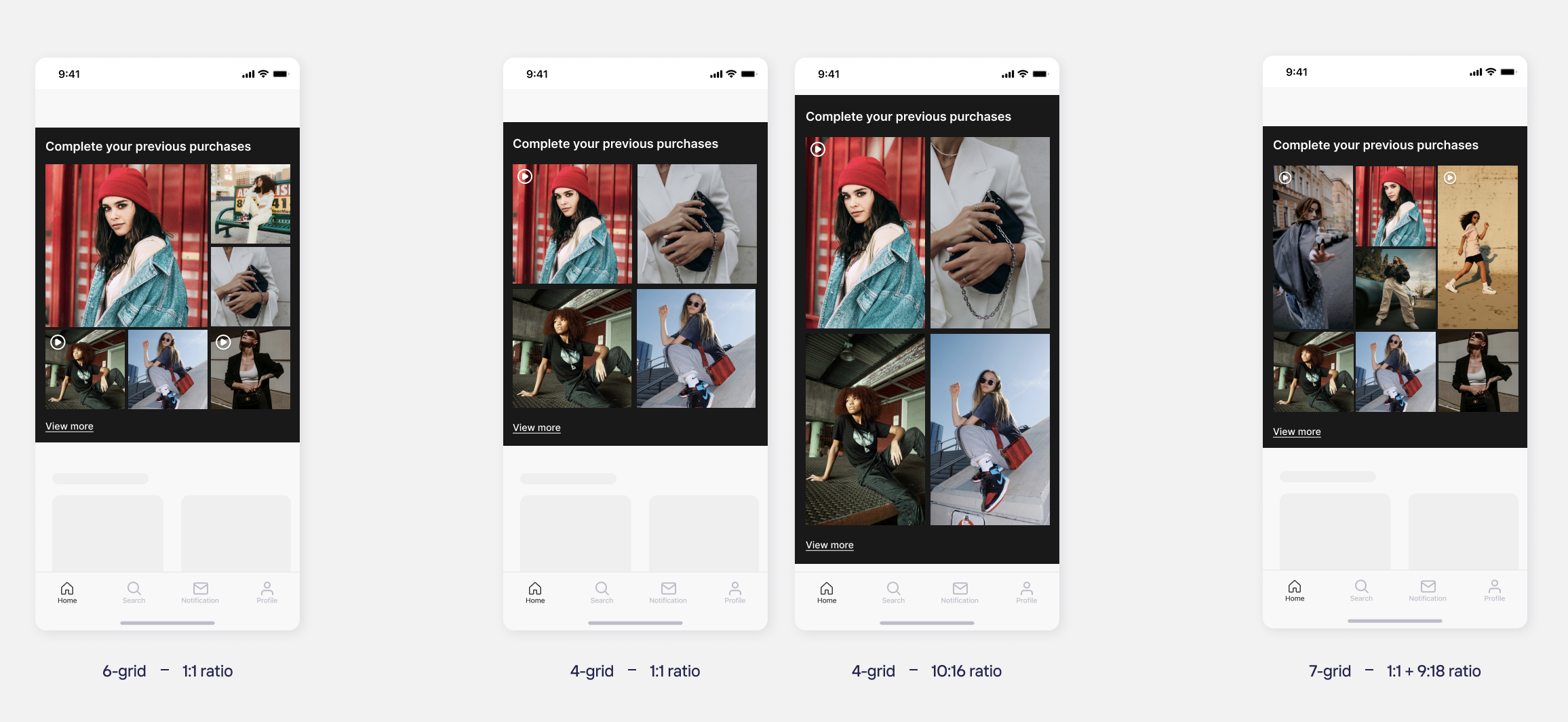
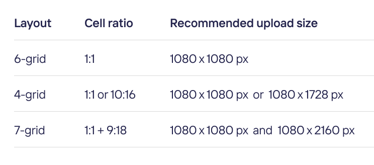
Canvas shows several media in a grid. Each layout uses a fixed set of cell ratios, so the size you should upload depends on the layout you choose.
In the 4-grid layout you can choose the cell ratio. The 6-grid and 7-grid layouts use fixed ratios.
- Canvas cells can hold both images and video.
- Video cells show a play icon and follow the same ratios and sizes as images
Customizing the interface
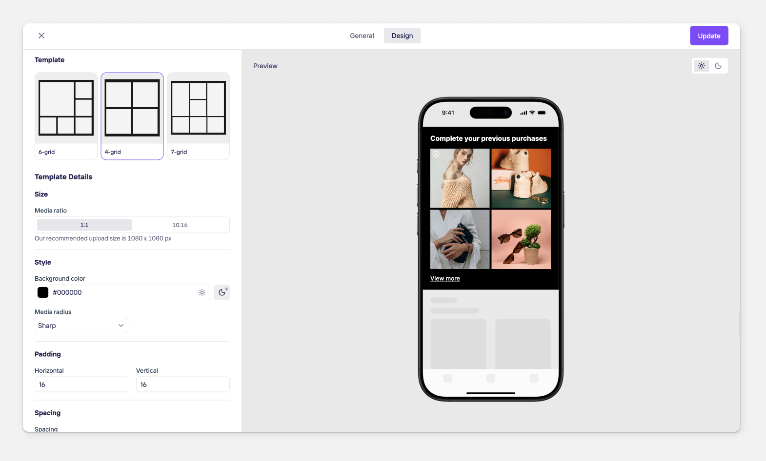
You can customize the following in the dashboard, under the Canvas widget's Design tab.
- Template (Layout): Choose the grid structure: 6-grid, 4-grid, or 7-grid. This sets how cells are arranged and how many media items are shown.
- Media ratio:
6-grid: fixed at 1:1
4-grid: selectable — 1:1 or 10:16
7-grid: fixed hybrid — 1:1 + 9:18
Style
- Background color: separate values can be set for light and dark themes
- Corner radius is defined as a percentage of each media cell's shorter edge, so it scales proportionally with the cell size rather than using a fixed pixel value.
Sharp — 0%
Soft — 5%
Rounded — 10%
Playful — 15% - Padding: Horizontal and Vertical padding for the widget's outer spacing.
- Spacing: Gap between media items inside the grid.
- Title (optional — can be turned off): Font, size, and color. Color supports separate light/dark values.
- Button (optional — can be turned off): Font, size, and color. Color supports separate light/dark values.
Updated about 2 hours ago
Did this page help you?