

Swipe Card Design Guide
How to Craft Clear, Actionable Swipe Cards That Users Love to Tap
Recommended size
Swipe Card pulls products directly from your product feed. To get the best result, make sure the images in your feed follow these guidelines.
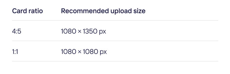
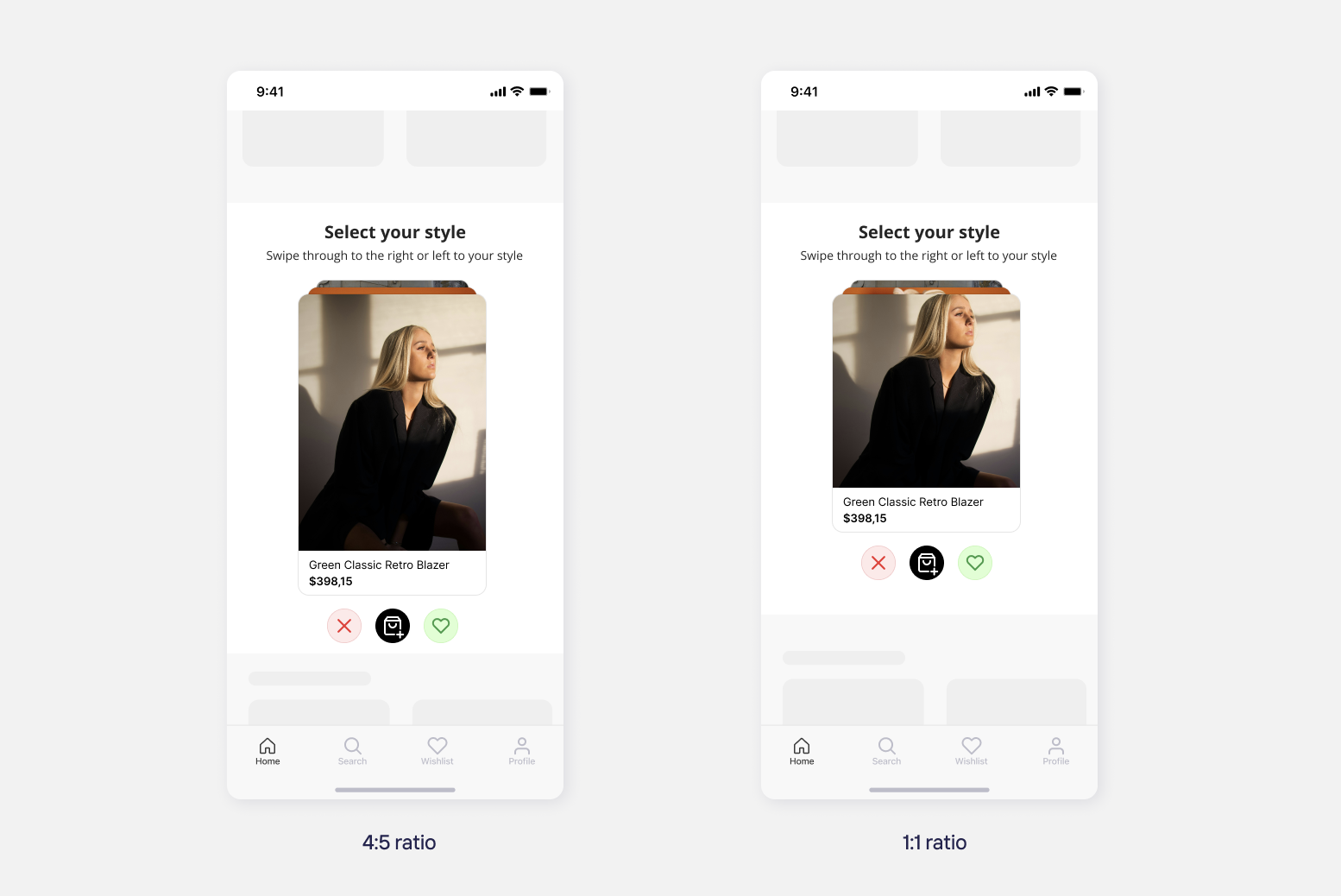
Feed images are cropped to fit the card ratio, so make sure the product stays centered in your feed images.
Customizing the interface
You can customize the following in the dashboard, under the Canvas widget's Design tab.
- Card ratio: Choose the card's aspect ratio: 4:5 or 1:1. This is the same ratio covered in Recommended size — your feed images are cropped to fit it.
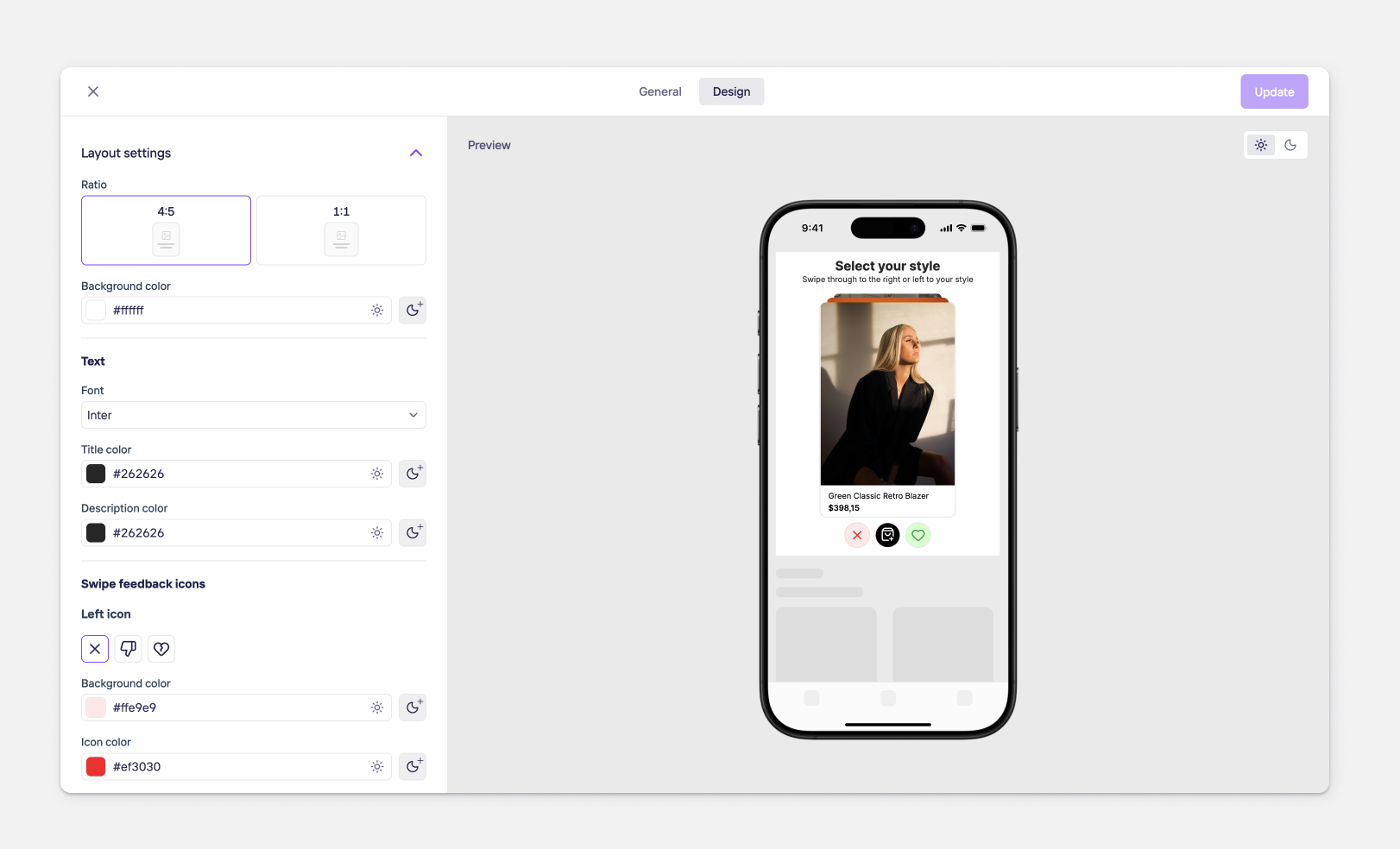
- Background color: The card's background color. Separate values can be set for light and dark themes.
- Text: The product title and price come from your feed, but you can style how they look
-Font
-Title color (separate light/dark values
-Description color (separate light/dark values) - Swipe feedback icons: The icons shown when a card is swiped.
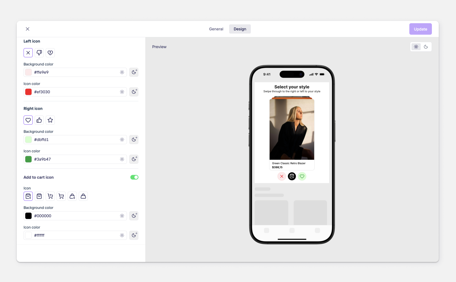
-Left icon (swipe to dismiss): choose a cross, thumbs-down, or broken heart. Set its background and icon color.
-Right icon (swipe to like): choose a heart, thumbs-up, or star. Set its background and icon color.
-Each color supports separate light/dark values.
-Add to cart icon (optional — can be turned off)
-Turn the add-to-cart button on or off. Choose from several icon styles, and set its background and icon color.
Updated 1 day ago
Did this page help you?